Thursday, 19 August 2010

Northfield Posters


My first plan was to decide how I wanted the poster to look; I wanted a symbol to represent ‘Fun’ so I went for an obvious idea of balloons as I felt children will quickly relate to this. I knew I had to place ‘Northfield Church Fun Day’ on the poster somewhere along with time, day and short address. I decided to have the title across the balloons and designed my own font, which deliberately I created very detailed, and in black and white, as I wanted to incorporate my style in some way on the poster. I also decided to write some of the events that would take place, such as bouncy castle, face painting, games and crafts. The colour scheme was definitely the hardest decision as I imagined lots of it to make it look exciting and appealing to the children, but at the same time I wanted it to be bold, clear and not clash the colours. I had an idea to add details to the balloons, I felt this was a way of including my patterns but at the same time will make the poster more interesting.

Saturday, 7 August 2010

Searching...

Still searching for someone I could interview and possible meet but no one nearby! Found Pedro Lucena, who's work is exactly like the style I am interested in...however he lives in Brazil! Considering emailing him though to see if he could answer some questions for me...

Friday, 23 July 2010

Personal Assignment

I was hoping to possibly do a personal assignment over Summer, maybe create a poster for an event or even a separate project. I wasn’t really concerned about what it could be for; I was more interested in continuing to work on my techniques and to improve my style. I didn’t want the summer to fly by without making any further progress leading onto my third year. So when I found out on Sunday at my church about doing a fun day for children in September, I had to volunteer to design the posters and flyers! They were happy for me to do so and I think this could be a real challenge for me, as I know my interest in creating detailed black and white drawings can’t really be used for this type of event. So....I have a vision to try and incorporate my detailed patterns into the poster but using colour instead of black and white. I'm a little bit nervous as I’m not sure if this is going to work! I want to make the poster look fun and exciting for children so I want to use a vibrant colour scheme and draw pictures of some of the events that will take place.

Watch this space for rough drafts...

Wednesday, 14 July 2010

Dave McKean


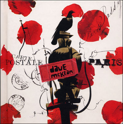
Bought this book on Dave McKean 'Carte Postale' that I stumbled across. It has lots of different black and white paintings in it. However, it is not particularly detailed and refined more free and unpredictable. But still a good book to look at.

Monday, 5 July 2010

Friday, 2 July 2010

Deanne Cheuk


Mike recommended Deanne Cheuk for me to research into as her style involves a lot of pattern and detail, I think her work is amazing. I would like to look at her for my GARP I think as she is a good modern illustrator to look at.


Anita Klein


I found an interesting female artist who I thought used black and white really well, it is not as detailed as the work i prefer but I like the way she creates a positive ambience even though they are in black and white. It is also clear she has a refined style as all of her work links together.